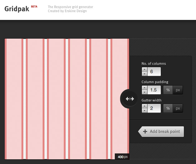
Gridpack is a free tool from Erskine Design that allows one to build a grid set for a responsive website. The application allows one to set breakpoints and to change the number of columns, size of gutter and padding for each breakpoint interval. The final result can then be exported to code. The package contains CSS, LESS and SCSS stylesheets, PNG images and a javascript snippet that allows one to overlay the PNG files over the web page with a simple key stroke.
Use Gridpack
Leave a Reply